3 min read
Honchō Scoops Up Two UK Search Awards!
It’s official, we've added not one, but two shiny trophies to our awards cabinet! We’re over the moon to share that we’ve triumphed at the UK Search...
9 min read
 Jade Halstead
:
Oct 13, 2022 9:30:28 AM

This Black Friday and Christmas we want you to think about how you can optimise your website landing pages and product pages for conversions.
Around these huge peak shopping periods, most marketers focus on driving traffic to their sites without considering the impact their website is having on their sales.
In this article we outline the main process of Conversion Rate Optimisation (CRO) in detail with ideas and examples you can start testing this peak sales season.
Use Google Analytics and other analytical tools to identify which area of the conversion funnel you want to prioritise in optimising in preparation for Black Friday and Christmas.
Usually, you want to prioritise the part of the conversion funnel that receives the highest amount of traffic, or generates the highest number of conversions, or has the highest drop-off rate. Focusing on these pages will have a higher impact on the site’s conversion rate and on the revenue of your business for these busy buying periods.
Here are the main general areas of CRO focus for different websites depending on the website’s goal:
If the goal is to purchase a product/service on e-commerce sites, the main CRO areas to focus on in preparation for Black Friday and Christmas are usually category landing pages, product pages, and the checkout pages. Basically, the whole purchasing conversion funnel.
Optimising your e-commerce website is particularly important during the Christmas period as there will be more search demand thus more traffic on your categories and products. So ensuring these visitors convert will be a key component in maximising your revenue.
Use Google Analytics, or other analytics tools, to look at the drop-off rate of users when purchasing specific products. Where the drop-off rates are highest, first test whether the pages are working correctly, then consider optimising and a/b testing this part of the purchasing funnel.

During the Christmas period, you will likely do ads such as Google search ads, Google Shopping ads, social media ads and so on. These ads will likely bring users to your product pages so it’s important to prioritise your product pages and consider doing CRO on them. Look at how long people are spending on the product pages, which buttons they are pressing to buy, and how many visitors drop off the product page. This will help you know which part of the pages to focus on. Test some of the product pages (particularly the most popular ones) and if patterns start to emerge then consider scaling these changes to all the product pages to maximise their conversion rates.
During the Christmas period the Homepage is also important to consider doing CRO on, particularly if ads are taking users to the Homepage. Use analytics to look at where users click on your Homepage so you can identify which area to optimise. Homepages should have low bounce rates as the purpose of Homepages is to take visitors to the pages that would meet their needs (usually product pages). Anything more than a 40% bounce rate for the Homepage is not good and you should definitely consider optimising and a/b testing..
If the goal is submitting a form, such as for a service, the main CRO areas are usually the form landing pages, the landing pages before you fill in the form and the actual signup form.
For the actual sign up form, you could test the number of input fields, the position of the form on the page, the colour and size of the submit button, and so on.
Usually the least number of input fields, the more likely the site visitor is to convert as users want ease and convenience. Make the process of submitting a form as simple as possible.
If the goal is signing up, such as to a newsletter, the main CRO areas are usually the sign up funnel, the sign up landing pages, and the sign up buttons and forms.
You can consider testing different locations for the sign up banner or form on the landing page. For the sign up button, you could test the colour, size and shape of the button, the text inside the button, the font size and font type of the button, and so on.
If the goal is clicking a CTA button, such as downloading a pdf, adding to cart, or triggering a pop-up, the main CRO areas are the landing page of the button and the actual button.
For the actual CTA button, you could test the size, shape and, more importantl,y colour of the button as well as the text, font size, font decoration, and font type of the text in the button, the position of the button and so on.
For the Christmas period you can even consider testing different Christmas colours, or adding Christmas icons inside the CTA button. This will help the button stand out on the page.
If the goal is creating an account, the main CRO areas are the main landing pages, the CTA (Call-To-Action) button for creating the account, the page where an account is created, and the actual creating the account form.
For the CTA button to create the account you could test the colour, size, shape and what the button text says as well as the size, colour, and font type of the text, the position of the button, and so on.
For creating the account form, you could test the number of input fields in the form, the colour and size of the submit button, and even the background colour of the form.
After you have identified what main area(s) you want to focus on and optimise first, it is best practice to create a hypothesis of what you believe to be true. This is what you will be testing.
Creating hypotheses help you test based on logic and data, and give the CRO process structure instead of just testing random areas. It is always best to start with big tests, such as a complete redesign of a page, and then focus on smaller incremental tests such as the colour of CTA (Call-To-Action) buttons.
For example, if you are trying to increase the number of visitors on the Homepage that click ‘Sign Up’:
Further in-depth examples at the end of this article.

Once you have your hypothesis and know what you want to test, the next step is to actually test it. The most common way to do this is to run an a/b test. Some CRO experts also run multivariate tests.
a/b testing (also known as split testing) is showing 2 versions of a page (Version a & Version b) to live visitors on a website/app and testing which page has the highest conversion rate. 50% of the visitors will be shown Version a, and 50% of the visitors will be shown Version n of the page.
Multivariate testing is almost exactly the same as a/b testing but instead of only showing two versions of a page to live visitors, you show as many versions of a page as you’d like.
For example, you can show visitors four different versions of a page, so 25% of visitors will be shown:
One thing we also want to mention at this point is that you should only test one variable at a time, otherwise you won’t know what change impacted the overall positive result.
In order to create your different page variations to test and run your a/b test, there are many a/b testing tools you can use. Below are some of our favourites:
Once you’ve run your a/b and multivariate tests, the next step is to analyse the results, and decide how to optimise your website/app to improve conversion rates.
Ask yourself ‘Was my hypothesis correct?’ The results of your test will answer this. If you are using a CRO tool, it will tell you which new variation had the highest conversion rate, and if the test was successful. Otherwise you can use an a/b test calculator such as AB Test Guide to calculate if the test is successful.
If your hypothesis was correct, and the test was successful, you can plan how to implement and scale these changes across your website/app. Work with your developer and design teams to determine the cost of the project and if it’s worth implementing the changes for the increased conversion rate. Even if the test is successful, you can decide to continue testing the same area to try to further improve the conversion rate.
If your hypothesis was incorrect and your test was not completely successful, you don’t need to immediately dismiss the results and look at another area. A very important part of the CRO process is to learn from the unsuccessful tests. Always look for learnings and takeaways from your tests. Analyse the data for further insights to help determine future hypotheses and tests.
In many cases, you don’t need a whole new hypothesis, instead simply just revise your current hypothesis with your new insights. After deciding your new hypothesis, repeat the previous steps and run further a/b tests to identify the changes that result in the highest conversion rates.
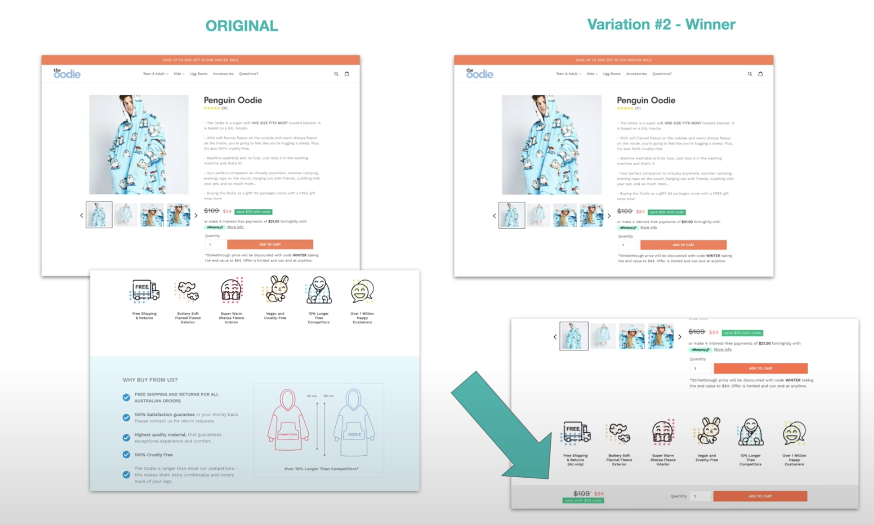
Davie Fogarty, Founder of Oodie, tested having a CTA always in view whenever someone was viewing a product.
He tested this on Oodie Australia and saw a 1.25% increase in revenue per session which estimated to $1.7 million in additional revenue per year due to this test.
Why it worked?
The hypothesis was that by having the CTA viewable at all times then it’ll always be front of mind, therefore more people would add to cart.

By adding labels to your products such as NEW or ECO-FRIENDLY, you could entice more people to view the products.
Checkouts can be long and tedious which is why testing the logistics, features, and user journey is vital. If people need to sign up this could be off-putting, and if you require a lot of details on a variety of pages, this can also be frustrating for users.
Are upsells easily visible on your site? Adding upsells can increase your order value whilst also advertising other products on your site that people may not have otherwise known about.
This test from Oodie saw a positive response with an increase of 0.45% which annually estimates to an increased revenue of $629,854.
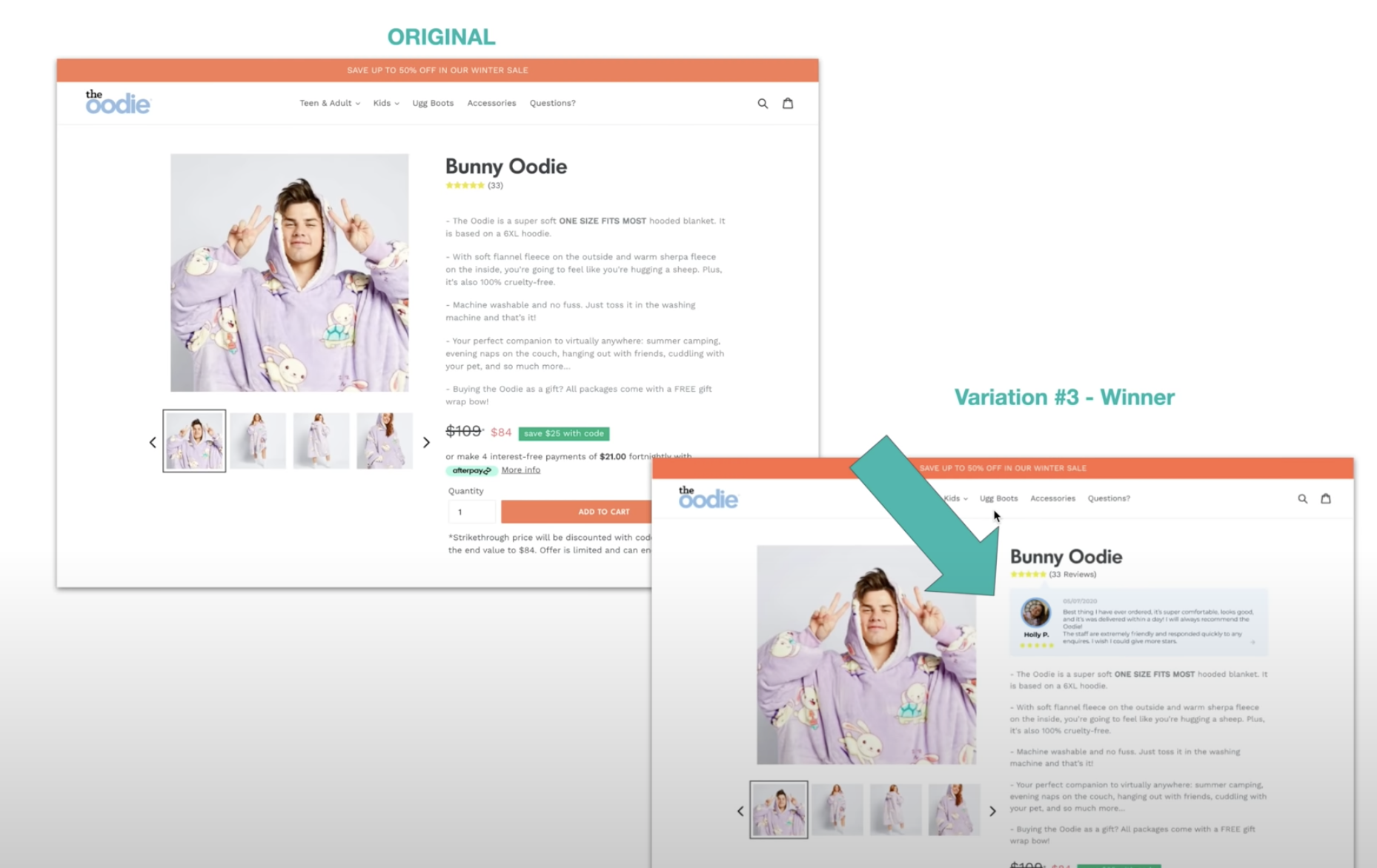
People LOVE reviews and usually they’re hidden away under all of the product information or users may need to click to expand reviews. Make seeing reviews easier for them by testing different placements.

Rather than distracting shoppers with a model image first, have a simple product image with a white-background first to help people understand exactly what it is people are buying.
Add model images second and see if your conversions increase.
This could be of the product, a review or a video from your founder to help build trust.
Test to see if people play the video and for how long.
UK Lash have a scrolling banner above their logo, and another banner below their menu. The black banner is very easy to read/see, and the top green scrolling banner stands out less, however due to the movement of the scroll, it captures shoppers attention.

We recommend you do both! Larger changes like new product page design layouts or the checkout process could have huge results in the realms of 10%+. However, minor changes that can be easily implemented can overtime, have huge impacts on your revenue.
This is why CRO is an on-going and continuous process that should be part of your marketing strategy.
If you’re ready to improve your Q4, let Honcho guide you.

3 min read
It’s official, we've added not one, but two shiny trophies to our awards cabinet! We’re over the moon to share that we’ve triumphed at the UK Search...

5 min read
Understand ecommerce attribution models which attribution models can maximise your marketing efforts and ROI.

3 min read
Explore how social commerce is changing the way we shop online, blending social interactions with digital commerce for a seamless buying experience.