3 min read

6 Tips for Mobile Optimisation

6 Tips for Mobile Optimisation Improve your mobile website’s search presence with our six top optimisation tips.

1) Setup Local Schema

Rich snippets that appear in local search results help your listing to stand out, increasing your click-through rate and driving more organic traffic to your site. On mobile, certain rich snippets also allow you to gain valuable local real estate. Here are just a few simple examples. There is a form of Schema for marking up just about anything on your website. Below are the key elements of Schema I would recommend for any local business:
  1. Location & Communication – Map, address, telephone number, opening hours.
  2. Reviews & Recommendations – Allow customers to see product or service reviews from others to help boost search click-through rates and improve user experience.
  3. Events – Displayed under your website’s organic listing on Google.

2) Create Google+ Local/Google Places for Business page(s)

Local search results on mobile devices are heavily based upon data uploaded to the free Google My Business platform. Claim your location and start optimising now for results page dominance. For businesses with more than one location, consider setting up a separate page for each. However, remember to keep your profiles updated regularly so that potential customers continue to find the correct information about your business. Read Bridget Randolph’s post on Distilled for an in-depth guide to local optimisation.

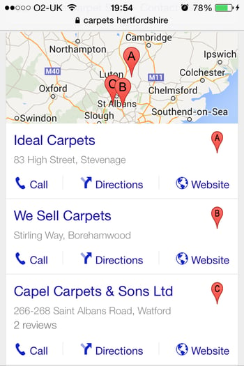
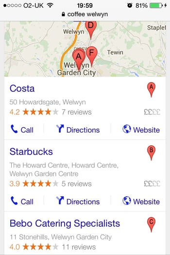
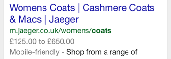
Note: The images above show local search results, Google gets this information from Google My Business pages highlighting the importance of creating them for your business.

3) Improve Usability/User Experience

I’ve seen so many sites that offer a layout which is almost identical to the desktop site, making it very hard to use. Especially when you consider the size of the mobile screen and the size of navigational links being presented. Simplifying your site so that the mobile user experience is clear and obvious is essential. Here is an example: Ok, so I love golf and want a new golf bag. After searching for ‘ cheap ping bags’ on my iPhone, the top two search results were clubhousegolf.co.uk (1st) and discountgolfstore.co.uk (2nd). Straight away, I spotted Google presented discountgolfstore.co.uk with the ‘mobile friendly’ tag.

As you can see from the two screenshots below, it’s quite clear that discountgolfstore.co.uk has the Google ‘Mobile-friendly’ tag for a reason. It would be interesting to the see the click through rates, bounce rates and conversion rates of these two pages since the ‘mobile friendly’ tag was introduced. Given that mobile usability is set to become a Google ranking factor this April, we wouldn’t be surprised to see discountgolfstore.co.uk outrank clubhousegolf.co.uk for the term ‘ cheap ping bags’ in the coming months.

Site usability essentials:
  • Simplicity of navigation, easy to select items without having to zoom in on the page.
  • Easy to click text, field and image options, also for the same reason as above.
  • Simple layouts & the minimum required text.

4) Optimise your site to become Google mobile-friendly

Google’s motivation is to provide high quality search results to its users, whatever device they are using. This Google Webmaster Tools post highlights the reasons why websites lack the mobile-friendly tag and details technical areas that need improvement. Highlights from the Google Webmaster Tools post:
  • The mobile-friendly tag is being rolled out worldwide on April 21st 2015.
  • Content from indexed apps now feature more in search results for signed-in users. (Implemented 26th February 2015).

5) Improve Site Load speed

From a user and brand loyalty perspective, if a mobile website was slow to load would you recommend or visit it again? I should think not. There are some great online tools to see how fast your site is and what the areas of your site can be improved, Google PageSpeed Insights and Pingdom being a couple. Get expert advice on the technical setup of you mobile website for achieving a faster load speed.

6) Include clear calls-to-action (CTAs)

Adding strong calls-to-action such as ‘ Add to Basket’ and ‘ Checkout’ on your mobile website is very important. Look at the emphasis on the CTA in the below image. ‘ Buy Now with 1-Click’ is very clear and commands the customer to take action. Especially notice the colour shading for each of the CTA buttons, the highest business priority button is the one with the highest contrast. Below are a few tips for creating great calls-to-action:
  • Size of buttons with CTA text on is important to get the attention of your customers.
  • Wording of CTAs needs to be clear and concise so that customers understand what action you want them to take.
  • Colour is a major winner with CTAs as you don’t want your most important CTAs to not be seen and drowned out by background colours.

Free tools to check your site’s mobile optimisation

Below are some areas to start optimising your mobile site, there are other areas of mobile to focus on too. However if you need any advice or assistance with any of these mobile optimisation tips iThinkMedia are here to help. Google Mobile Friendly Checker: https://www.google.co.uk/webmasters/tools/mobile-friendly/ Google Page Insights – Check Site Speed: https://developers.google.com/speed/pagespeed/insights/ Apple iOS Simulator Tool Guide: https://developer.apple.com/library/ios/… Usability Testing: https://www.optimizely.com Mobile Analytics: http://mobileanalyticssimplified.com/ http://bango.com/mobileanalytics/ http://www.amethon.com/mobile-analytics/ Do you use any tools for optimising your site and especially for your mobile site? Why not share with the group, it’s always great to hear about new tools out there.

Explore Our Services

DIGITAL PR 

Earn authoritative links and drive brand awareness with Digital PR

PAID SEARCH

Deliver instant traffic and revenue through Paid Search and Shopping

SOCIAL ADS

Reach new audiences and retarget existing ones on social channels 

CONTENT

Attract and engage website visitors with a well executed content strategy

Harnessing High Search Volume Keywords for Maximum Impact

5 min read

Harnessing High Search Volume Keywords for Maximum Impact

Discover the power of high search volume keywords and how to effectively use them to boost your online presence and drive maximum impact.

Read More
Honcho partner with Eflorist to support Digital PR campaigns across Europe

2 min read

Honcho partner with Eflorist to support Digital PR campaigns across Europe

We're delighted to officially announce our partnership with Eflorist, one of the world’s leading flower delivery brands with over 54,000 local flower...

Read More
Driving Digital PR in Automotive: How to Win

5 min read

Driving Digital PR in Automotive: How to Win

Working agency-side in digital marketing often means that you’re expected to be a jack of all trades, with industry expertise stretching across...

Read More

Google’s Deduplication update: is there value in featured snippets?

On Wednesday 22nd January 2020, Google rolled out a significant update to the first page of the search results, which has caused quite a commotion...

Read More

Google AdWords Ad Extensions for Call-Only Campaigns

With the way the world is and continuing to go, the dominance of the “mobile first” world is pretty much the norm. All you need to do is ask yourself...

Read More

Google’s move to mobile-first indexing for all new websites – date released

According to Barry Schwartz, Google has just announced all new websites that are not known to Google search will be indexed using mobile-first...

Read More