3 min read
Honchō Scoops Up Two UK Search Awards!
It’s official, we've added not one, but two shiny trophies to our awards cabinet! We’re over the moon to share that we’ve triumphed at the UK Search...
4 min read
Admin : Apr 27, 2017 7:36:56 AM
With continuous changes in the industry, it appears that SEOs and designers have never quite agreed on very much, but are things about to change? James Robinson from Stripe Blue Digital has given us an insight into how the relationship between SEOs and designers has always been one big battle.
SEOs and designers have historically had their differences. Some might even say a war has raged between the two groups where they intersect in the customer journey.
 Image credit: HBO – Game of Thrones
Like any wars, there are common battlegrounds that the two groups have faced off against each other on many occasions.
Quantity of content
Designers wanted to keep lines clean, minimise distractions and focus on directing the user into taking action. Often they would create an image heavy experience – after all, a picture paints a thousand words, doesn’t it?
SEOs wanted to put as much text content on the page as possible to drive lots of traffic to it. A picture may paint a thousand words to a user, but a search engine spider missed out on all that!
Text in images
Some designers would use text within the images themselves for aesthetic reasons.
SEOs would instead want to overlay text on an image.
Hiding text behind tabs and accordions
Designers would hide text behind tabs and accordions to keep the site looking clean.
SEOs wanted text out on display to avoid having that content ignored, as John Mueller from Google said: “if you want that content really indexed, I’d make sure it’s visible for the users when they go to that page”.
Use of H tags
Some designers would use H tags to control the size of text, leading to multiple H1 tags for example. A designer might also have designed a section of the page with a very short H tag in mind.
SEOs would ask the designers to remove additional H tags and control text size with CSS. An SEO might want a longer H tag than the designer had allowed for to target particular keywords!
Buttons, images and text links
A designer would use buttons or imagery to link between pages.
An SEO would insist on descriptive text based anchor text.
There are plenty of other battles so whether you count yourself as part of the design or the SEO camp, we can probably agree these battles were commonplace and frustrating all round!
Then came the rise of mobile browsing…
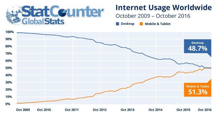
The explosion in mobile use has been rapid and as of October 2016, mobile and tablet devices are the predominant devices used to view web content.
 Image credit: StatCounter November 2016
Reacting to this rapid change, Google pushed through a mobile friendly ranking algorithm for mobile devices in 2015 that had SEOs and designers alike scrambling to adapt. It drove a lot more SEOs and designers to change the way they worked and invest more in their mobile skills.
It has driven many big companies to a new way of thinking entirely, building a mobile-first experience and adapting it to work on a variety of different viewport sizes from tiny screens up to large desktop resolutions.
Google themselves started changing the desktop search experience to make it look more like the mobile search experience and they aren’t far off changing to a mobile-first index too.
This growth in mobile has changed the way sites are built and optimised.
Page speed
![GaryIllyes[3]](https://www.honchosearch.com/hubfs/Imported_Blog_Media/GaryIllyes3.jpg) Image credit: https://plus.google.com/+GaryIllyes
Image credit: https://plus.google.com/+GaryIllyes
Since 2010 Google has publicly talked about page speed being a ranking factor and more recently, Gary Illyes of Google has talked about making it an important ranking factor for mobile SERPs in particular.
Why should it be an important ranking factor? Well, users are impatient and according to Kissmetrics, 47% of users expect a website to load in less than 2 seconds. Google wants to serve up websites which provide the user with a good experience. A slow loading website is not a good experience. Mobile users (when they are not on WiFi) need a lightweight fast-loading web page in particular!
Both SEOs and designers should agree that site speed is important to the user and to search engines, which should take away battlegrounds of yore like creating an image-heavy experience.
You see more blog posts out there talking about the same goals, but from different angles:
SEO angle on speeding up a site:
https://www.crazyegg.com/blog/speed-up-your-website/
Design angle on speeding up a site:
https://99designs.co.uk/blog/tips-en-gb/signs-you-need-a-website-redesign/
User experience on mobile leaves less room for error

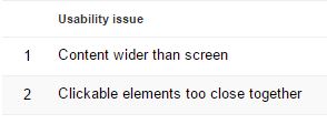
Introducing a section in Google Search Console on ‘Mobile Usability’ and telling SEOs that ‘websites with mobile usability issues may not rank as well in mobile search results’ was a great way to nudge SEOs into thinking about onsite usability, as well as bringing it closer to designers – thanks Google!

Some of these mobile usability issues removed previous battlegrounds as well. ‘Clickable elements too close together’ is a driver to reducing the use of image and button links.
Google understanding mobile styling to conserve space
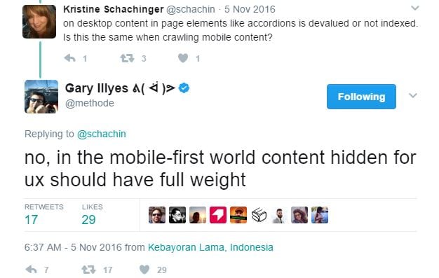
In the battle for clean lines, designers loved to hide SEO content in accordions and tabs. This was a problem as, historically, Google did not like accordions and tabs on desktop sites. They were often used to stuff lots of content into pages.
However, Gary Illyes clarified that on mobile sites content hidden for UX is ok:

SEOs and designers should both be happy and agree on the use of hiding text a lot more. Clearly, there will be some compromise around how much to hide in this manner, but if both parties have the user in mind these battles should be less heated!
The growth in mobile use has been explosive and there is no doubt it driving big changes in SEO and design thinking. The net result is both sides should be more aligned when it comes to user experience.
What do you think? Do you see fewer battles between SEOs and designers these days? Or have the battles just moved to new ground?
James Robinson has been a digital marketer since 2006. He’s had a career leading teams and developing successful strategies in agencies and client side.
Now James is a freelance digital marketing consultant who provides consultancy, training and white label services for design, development and digital marketing agencies through his company called Stripe Blue Digital.


3 min read
It’s official, we've added not one, but two shiny trophies to our awards cabinet! We’re over the moon to share that we’ve triumphed at the UK Search...

5 min read
Understand ecommerce attribution models which attribution models can maximise your marketing efforts and ROI.

3 min read
Explore how social commerce is changing the way we shop online, blending social interactions with digital commerce for a seamless buying experience.